"Basic Photoshop for Artists" posts started
as an easy way to reveiw my Oct. 2nd workshop
online.
This workshop was part of the Watercolor Society
of Oregon Convention in Salem, Oregon.
To my surprise, within the last 8 days, more than
850 people in 54 countries have decided to
follow or check these posts.
The comment on the last post came from a photographer
Patricia Snook - http://www.awonderingstar.com/
in England. Thanks Patricia for visiting my blog!
Some artists following these posts have asked
to continue this instruction in private lessons online
and in person.
I will email lessons to those of you
who would like to register for instruction.
You will receive the photo in jpg. format,
the lesson and interactive exercises to reinforce the lesson.
The fee will be $25 a month for two lessons via email.
All correspondence for these lessons will be through
this email:
learnwithlinda(at)gmail.com
Please
insert the @ for the (at) when you
use this email address.
Those artists who live within 30 miles of Portland, Oregon
can contact me about private lessons for $30 an hour
for the first hour and $25 for each additional hour.
I travel 100 miles to give private lessons to those willing
to help pay for gas.
For those of you living in or near Florence, Kathryn Damon-
Dawson is organizing my
"Basic Photoshop for Artists" Workshop in Florence,
Oregon in February.
Thank you to all of you who have expressed an
interest in classes and continue to follow my blog.
Now, back to our lesson:
Basic Photoshop for Artists - Threshold
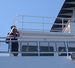
Does this image have the potential to
be a strong composition with an interesting value pattern?
Here is the first of two approaches that work for me:
Menu Bar>Enhance>Adjust Lighting>Brightness
Contrast>Look in the dialogue box that pops up.
Slide arrow to right>
Contrast will increase to show darks. Slide the opposite
way to see less contrast.
The second approach is more dramatic.
Menu Bar>Filter>Adjustments>Threshold
A pop up box will appear>Slide arrow back and
forth to see more and less of blacks and whites.
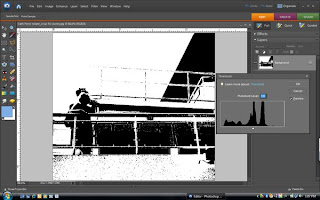
At this point the values can be easily examined
and I am either hooked on the image or decide to move
on to a different photo. Sometimes the addition
or subtraction of line or shape with the pencil or brush
tool can make the difference.
If you choose to use this filter, and click OK, save this image
under a different name.
If you click OK, and do not save under a
different name, you will have only a black and
white image that will replace your working
image, that you opened to learn this step.
So, everybody out there...should I continue on
and create a painting of this image?
as an easy way to reveiw my Oct. 2nd workshop
online.
This workshop was part of the Watercolor Society
of Oregon Convention in Salem, Oregon.
To my surprise, within the last 8 days, more than
850 people in 54 countries have decided to
follow or check these posts.
The comment on the last post came from a photographer
Patricia Snook - http://www.awonderingstar.com/
in England. Thanks Patricia for visiting my blog!
Some artists following these posts have asked
to continue this instruction in private lessons online
and in person.
I will email lessons to those of you
who would like to register for instruction.
You will receive the photo in jpg. format,
the lesson and interactive exercises to reinforce the lesson.
The fee will be $25 a month for two lessons via email.
All correspondence for these lessons will be through
this email:
learnwithlinda(at)gmail.com
Please
insert the @ for the (at) when you
use this email address.
Those artists who live within 30 miles of Portland, Oregon
can contact me about private lessons for $30 an hour
for the first hour and $25 for each additional hour.
I travel 100 miles to give private lessons to those willing
to help pay for gas.
For those of you living in or near Florence, Kathryn Damon-
Dawson is organizing my
"Basic Photoshop for Artists" Workshop in Florence,
Oregon in February.
Thank you to all of you who have expressed an
interest in classes and continue to follow my blog.
Now, back to our lesson:
Basic Photoshop for Artists - Threshold
Does this image have the potential to
be a strong composition with an interesting value pattern?
Here is the first of two approaches that work for me:
Menu Bar>Enhance>Adjust Lighting>Brightness
Contrast>Look in the dialogue box that pops up.
Slide arrow to right>
Contrast will increase to show darks. Slide the opposite
way to see less contrast.

The second approach is more dramatic.
Menu Bar>Filter>Adjustments>Threshold
A pop up box will appear>Slide arrow back and
forth to see more and less of blacks and whites.

At this point the values can be easily examined
and I am either hooked on the image or decide to move
on to a different photo. Sometimes the addition
or subtraction of line or shape with the pencil or brush
tool can make the difference.
If you choose to use this filter, and click OK, save this image
under a different name.
If you click OK, and do not save under a
different name, you will have only a black and
white image that will replace your working
image, that you opened to learn this step.
So, everybody out there...should I continue on
and create a painting of this image?
Comments
The image keeps painting itself in my mind
and I see many possibiliies.
Thanks for your comment. A Painting with paper and paint.
Linda